top of page


PROJECT OVERVIEW
Habitat: Embodying "Less is More" in Exclusive Property Management
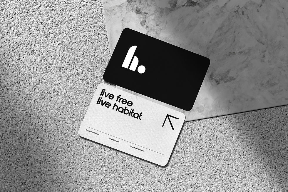
Introducing "Habitat," where the philosophy of "less is more" guides our approach to premium property management. Through a minimalist and sophisticated visual identity, we ensure that every detail of the brand reflects the exclusivity and high standards of our services.
Our logo for Habitat—a sleek integration of an 'H' with a sphere—captures the essence of minimalist design while symbolizing comprehensive property care. The monochrome palette with natural accents emphasizes clean, understated elegance, appealing to an upscale clientele seeking clarity and sophistication.
OUR JOB
Digital Content, Brand Identity, Collateral Design


Subtle Signage, Significant Presence
From building directory signage to vehicle branding, Habitat’s collateral maintains the minimalist aesthetic. These elements are designed not just for functionality but to enhance the property's ambiance, ensuring that even the simplest sign or decal reflects the brand’s commitment to refined living.


Expressive Minimalism in Outdoor Advertising
Our billboard concepts, featuring slogans like "Live Exclusively, Live Habitat," use striking visuals such as a treehouse blending into the sky to communicate the unique living experiences Habitat offers. These images, paired with succinct messaging, exemplify how less really is more, by conveying a powerful message through simple yet impactful design.


bottom of page


