top of page


PROJECT OVERVIEW
"Taste the Waves" A Name and Identity Rooted in Japanese Tradition
"Kai," meaning ocean in Japanese, perfectly embodies the essence of this high-end sushi and cocktail bar. The brand identity draws inspiration from the vastness and beauty of the ocean, with the iconic Japanese wave as a central design element. The logo features the word "Kai" with a wave elegantly integrated into the lettering, striking a balance between youthfulness and refined artistry, perfectly capturing the spirit of the bar.
OUR JOB
Brand Identity, Collateral Design, Web&App, Digital Content


Elegant and Artistic Touches in Every Detail
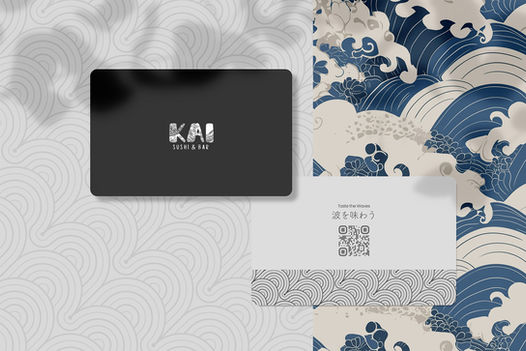
Kai’s collateral designs, including boxes, cards, and tableware, carry the wave motif throughout, ensuring a cohesive and elegant brand experience. Each piece is thoughtfully crafted to reflect the high-end nature of the bar while maintaining an artistic flair that resonates with a discerning clientele.


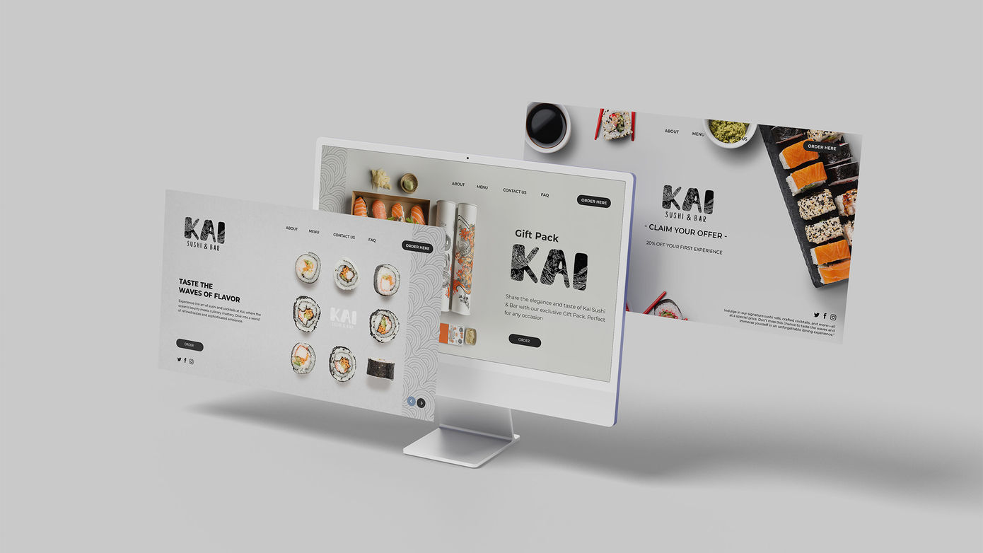
A Seamless Digital Experience Reflecting Kai’s Sophistication
The website for Kai Sushi & Bar offers a seamless digital experience, mirroring the brand’s elegance and attention to detail. With a design that echoes the wave theme and a user-friendly interface, the website not only provides essential information but also immerses visitors in the refined ambiance of the bar, enticing them to explore Kai’s offerings.


bottom of page


